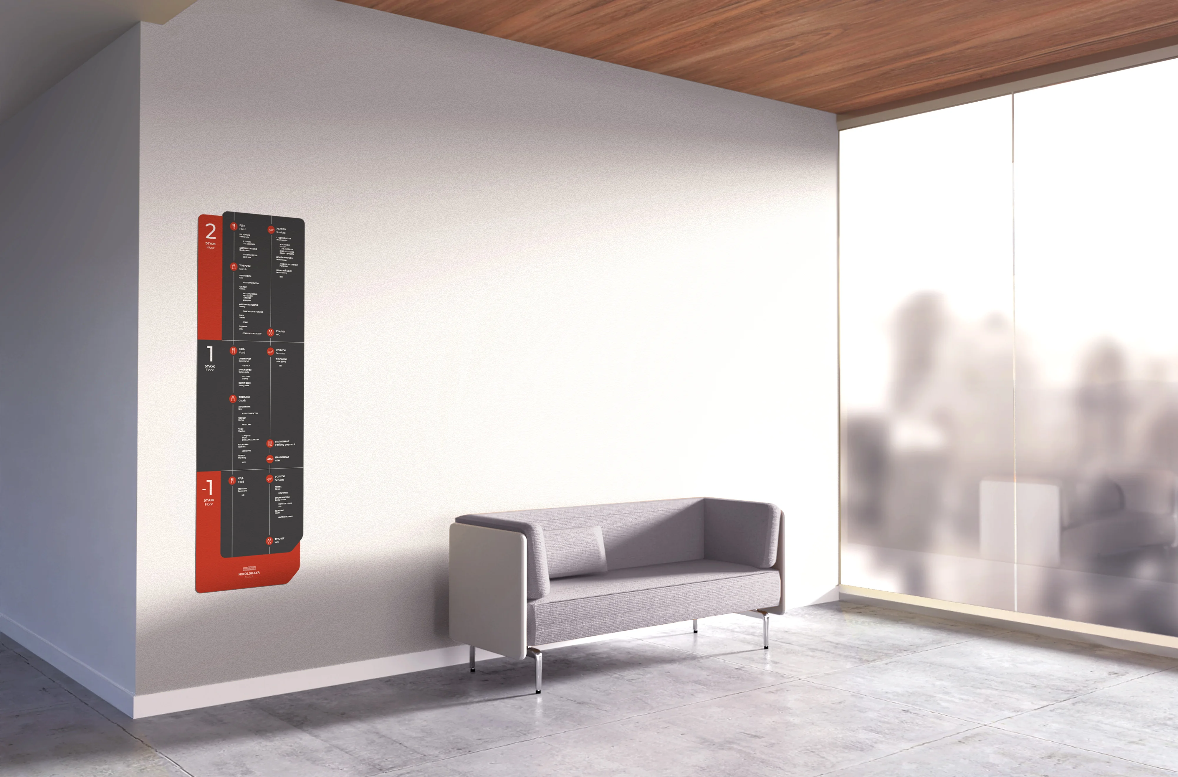
A wall-mounted floor navigator installed in the Nikolskaya Plaza lobby beside a sofa, in anthracite and red, under a wooden ceiling.
← Ekaterina Lopushenko Branding & wayfinding

Nikolskaya Plaza

Two audiences, three levels, one entrance — and a building people were walking into to ask where things were.

Client
Nikolskaya Plaza
Years
2019 — 2021
Place
Moscow
Role
Wayfinding system, specification, print

The brief

A retail and office centre in the historic core of Moscow, off Nikolskaya, with two audiences moving through the same doors.

Shoppers head for the galleries, tenants head for the offices above, and both arrive at the same lobby. The retail galleries run over three levels — two above ground and one below — with the office floors stacked above them. The building had no navigation at all, and visitors were asking reception where things were.

The job was not a set of signs. It was a system that could be specified, quoted, manufactured by a contractor who had never seen the drawings before, and extended every time a tenant moved out.

The idea

One cut corner, sixty-nine carriers

Every element in the system is the same shape: a rounded rectangle with one corner cut away. The cut marks the leading edge — the side the visitor is moving towards — so the silhouette of a sign agrees with the direction it is sending you before a single word is read.

Anthracite carries the information, red carries the level number and the brand. Nothing else is allowed to be red, which is why a floor number can be found across a foyer.

The system

Six families, coded

Every carrier has a code and a drawing. That is what lets a facilities manager order a replacement three years later and get the same object back.

CodeFamilyTypes
ЭОExterior — general12
ЭПExterior — parking11
ИТЦInterior — retail7
ИОЦInterior — offices7
МПSmall print & door plates28
ПParking deck4
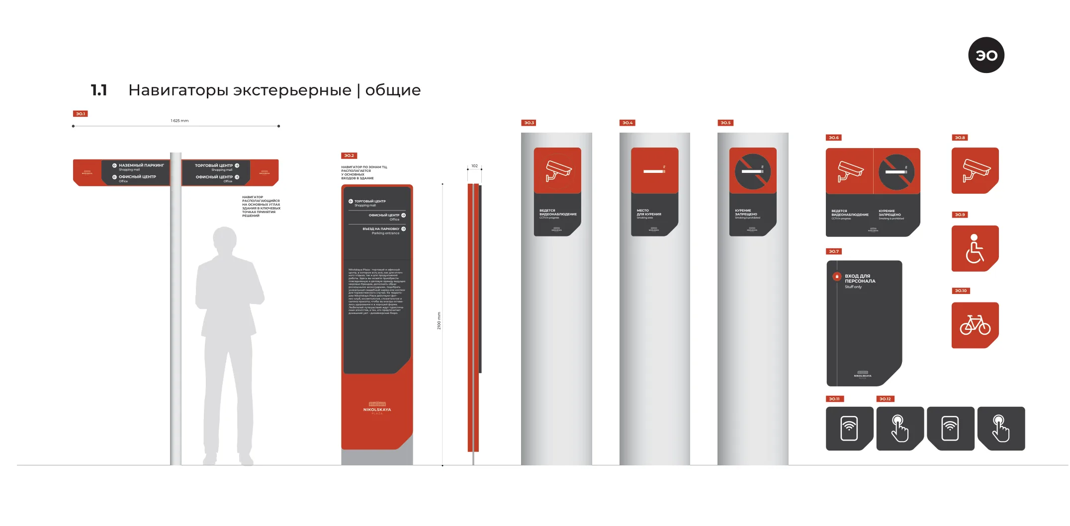
Specification sheet for exterior signs: a two-arm post sign, a 2500 mm pylon with a building description, three bollard-mounted plates and a set of prohibition and service icons, each coded EO.1 to EO.12.
Exterior family. Each sheet carries the code, the millimetre dimensions and a human silhouette, because a sign is specified from reading distance, not from the layout.
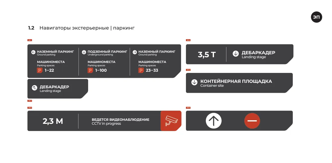
Parking sign specification: multi-panel directional signs with parking space number ranges, height and weight restriction plates.
Parking approach — space ranges, height and weight limits.
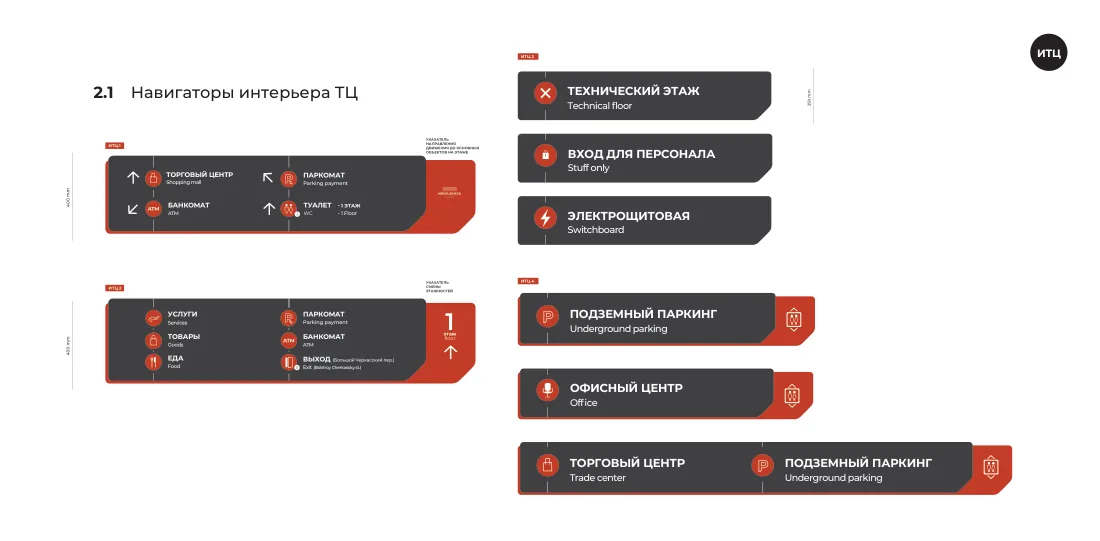
Interior retail signs: hanging directionals with pictograms, floor-change indicators and lift-lobby plates.
Retail interior — directionals and floor-change plates.
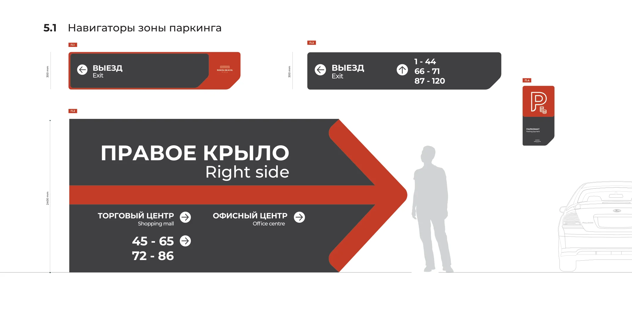
Parking deck specification: two 300 mm exit signs with space ranges, a wheelchair bay plate, and a 2400 mm wing navigator whose vermilion arrow runs the width of the sign, with a person and a car drawn beside it at true scale.
Parking deck. The wing navigator is 2400 mm across and the arrow is part of the sign, not an icon on it — because a driver reads this at speed, from a car, in low light. The person and the car on the drawing are there at true scale, so the size is argued rather than asserted.

A sign is specified from reading distance. Not from the layout.

The rule that makes it a system

The plate resizes, the type does not

The hard part of a tenant directory is that tenant names are different lengths and change every season. So the plate is not drawn per sign — it is generated by a rule.

Three width bands, each with a fixed plate height, and a second table for the cases where the plate scales proportionally instead. Over 200 mm of content takes a 190 × 32 plate, 170–200 takes 150 × 32, under 170 takes 120 × 32. The contractor reads the band, not the designer's intention.
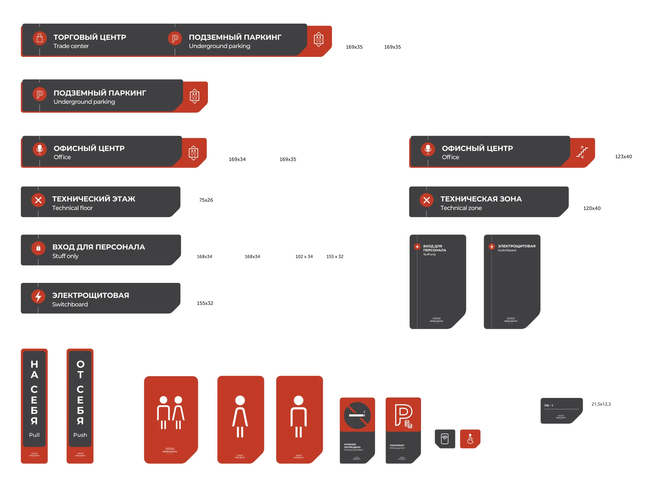
Production sheet for small-format plates with exact millimetre dimensions beside each: 169×35, 168×34, 155×32, 123×40, 75×26 and others.
Small format, dimensioned to the tenth of a millimetre. Twenty-eight plate types, from a lift-lobby sign down to a 21.5 × 12.3 mm button label.

Floor navigators

Three ways to ask the same question

People arriving at a lift lobby want one of three things: to see the floor plan, to find a category, or to find a shop by name. Rather than compromise on one board, the system carries three variants of the same 1700 mm object — map, category, category with tenants — and the building picks per location.

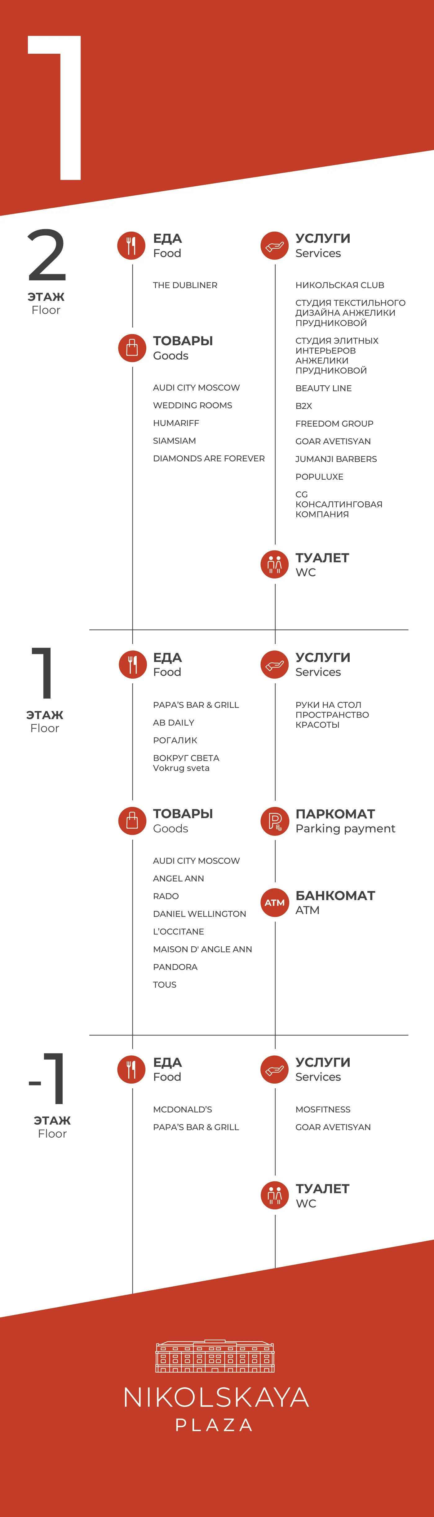
The 2.6 metre directory takes the same logic to full height. It is not an alphabetical list but a matrix of floor against category, so “where is Audi City” and “where can I eat” are answered on one board, and its plan version is the same frame with the same levels answering the other question.
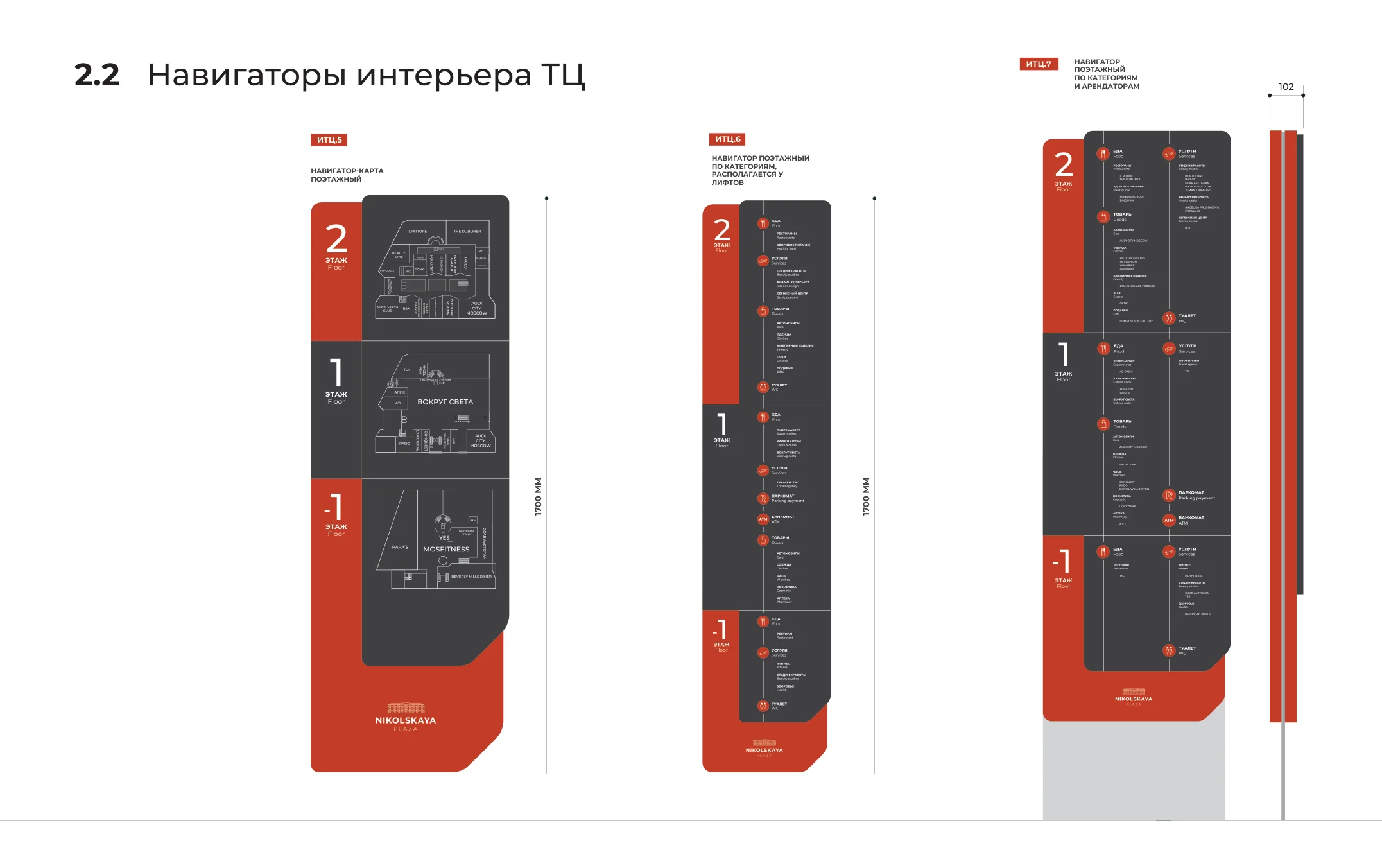
Three floor navigator variants side by side at 1700 mm: a plan-based board, a category board and a category-with-tenants board, each stacking levels 2, 1 and −1.
Levels 2, 1 and −1 stacked in the same order on all three, so a returning visitor never has to relearn the board.
The 2.6 metre tenant directory pylon: floors 2, 1 and −1 down the left edge, and columns for Food, Goods, Services and WC, each headed by a red pictogram disc and filled with real tenant names.
Directory, 2600 × 745 mm.
Reissued April 2021.
The same pylon in its plan version: three floor plans stacked with numbered location markers.
Plan version.
Same frame, same levels.
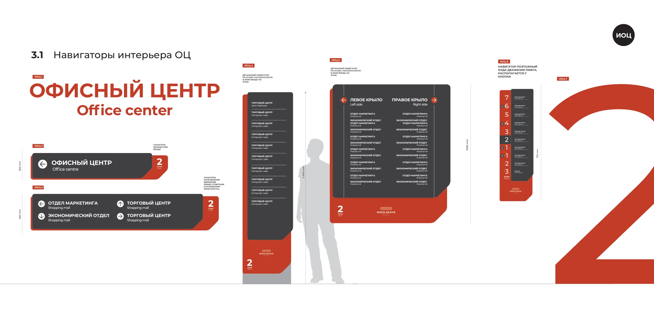
Office interior signs: a wing directory listing departments, and a narrow 700 mm lift navigator stacking ten levels from 7 down to −3, each labelled with the zone it belongs to, the current floor picked out in dark.
Office side. ИОЦ.6 is a 700 mm strip that mounts beside the lift call button and names all ten levels — offices at 7 to 4, administration at 3, retail at 2 to −2, parking at −3. The floor you are standing on is the one tab that goes dark.

Small print

The part nobody photographs

Twenty-eight plate types: office door numbers, tenant slots, lift regulations, push and pull, staff only, switchboard, technical floor, and the two access-control signs that tell an office visitor whether to tap a pass or press a button. All of it bilingual, down to a 21,5 × 12,3 mm button label.

This is where a wayfinding system either holds together or quietly stops being one, because it is the part that gets ordered in a hurry, three years later, by someone who was not in the meetings.
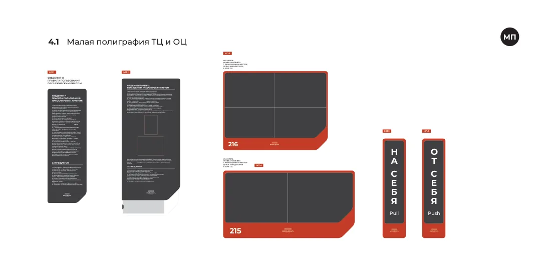
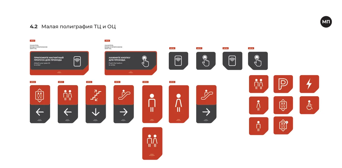
Small print specification: lift regulation panels, tenant slot plates numbered 215 and 216, and vertical push and pull plates.
Lift regulations, tenant slots, push and pull.
Service plates: two wide bilingual access-control signs, then a row of two-part plates with a red pictogram half above and a dark arrow half below — lift, toilets, stairs, escalator — and toilet plates that are red the whole way down.
Two-part plates: red half says what, dark half says which way. Plates with nowhere to point — the toilets you are already standing at — drop the dark half and stay red, so direction is visible as a shape before the arrow is read.
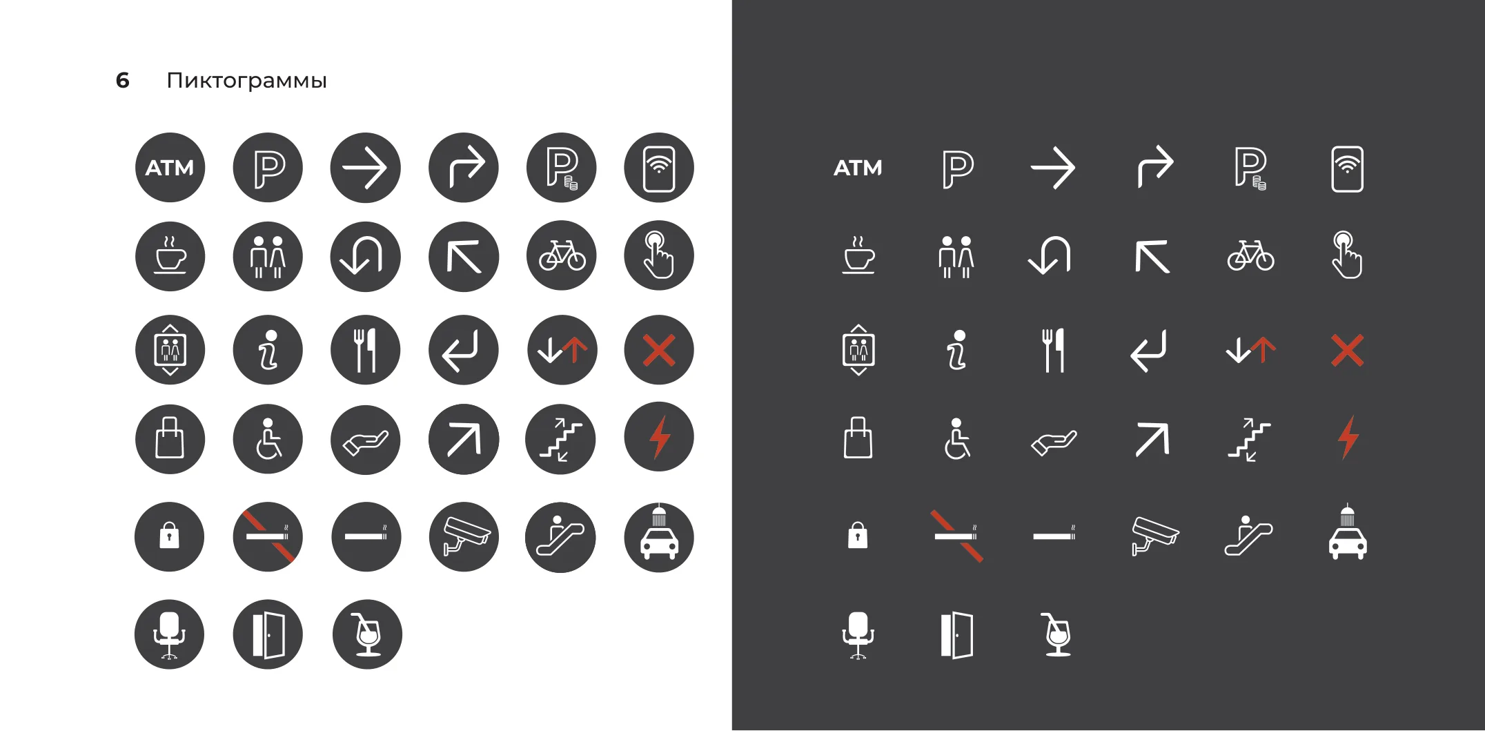
The complete pictogram set: thirty-three icons drawn on one grid, shown knocked out of dark discs on the left and as line marks on a dark ground on the right.
Thirty-three pictograms on one grid at one stroke weight, drawn in two treatments — filled disc for signage, line only for print. Red is reserved for the three that mean stop.

On the wall

Installed

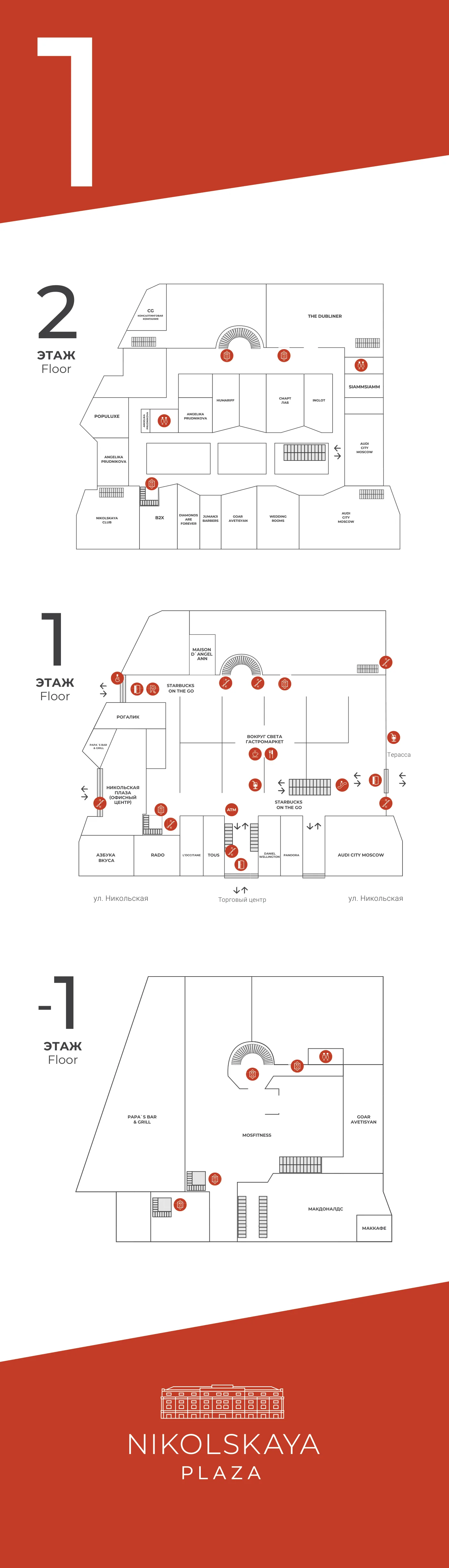
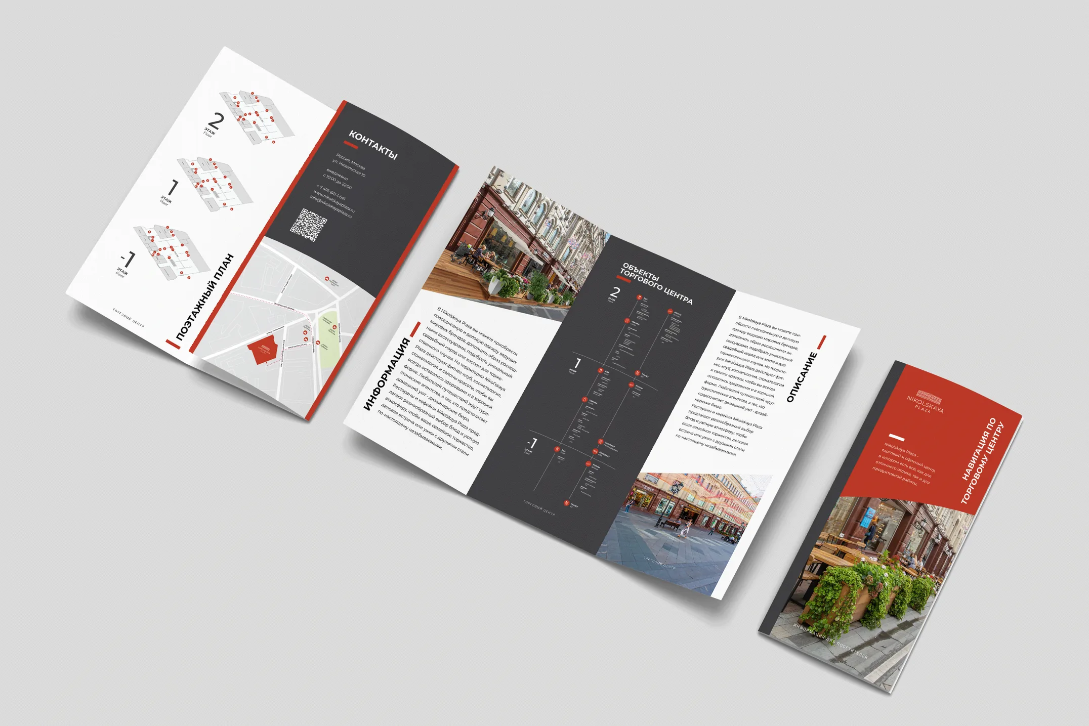
The system went in across the retail floors, the office lobbies and the parking deck, and was reissued in 2021 with the tenant list the building actually had by then. A printed navigator for the reception desk carries the same three floor plans in the hand.
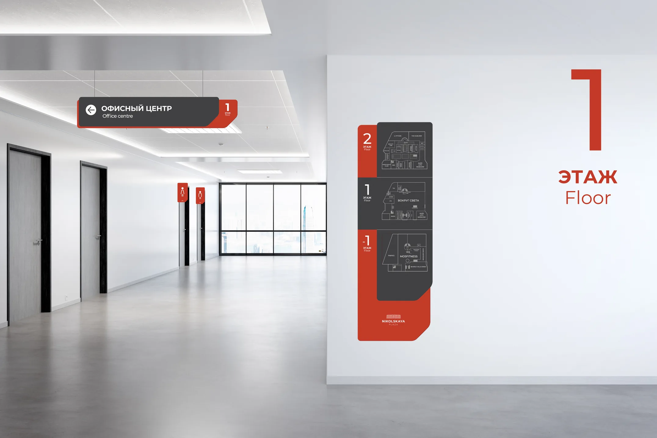
An office corridor with a ceiling-hung directional to the office centre, and a floor plan applied to the end wall under a large red numeral one.
Corridor: hung directional overhead, floor plan on the end wall, level number large enough to read from the far door.
The printed navigator booklet opened out, showing floor plans, a district map and photographs of the building.
Printed navigator for the reception desk.

More work